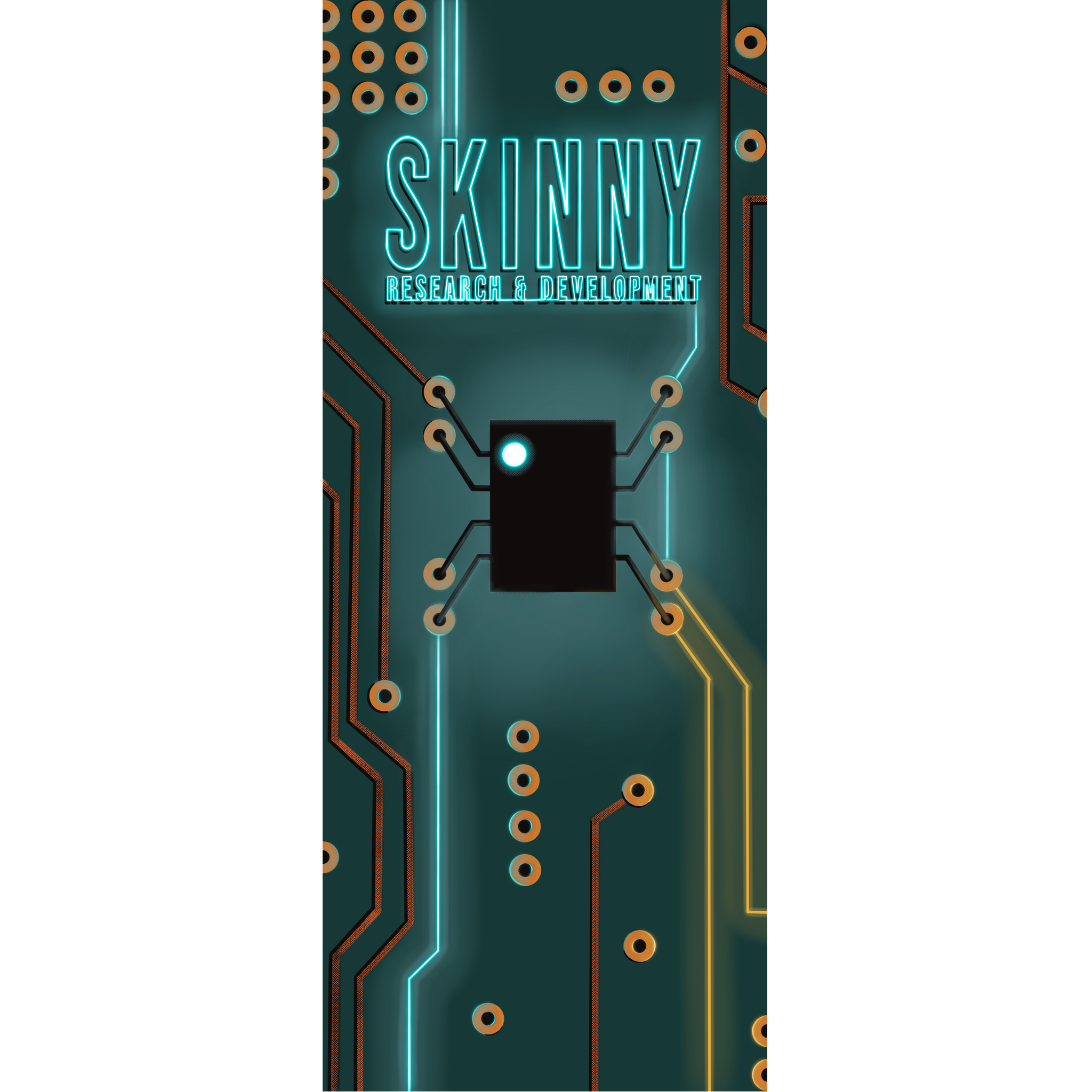
Skinny Research and Development
is a community-focused enterprise that provides custom engineering solutions, tailored technical instruction, and educational resources for techs. Their focus is on building up technicians and engineers to give them the tools and knowledge to excel.
As a startup with a single device suddenly going into production in 2013, Skinny R&D found itself in need of a logo in short order. They went to an online logo farm and were well served by the logo they received for several years. Then came messages from other businesses remarking on their shared icons. It was time for a rebrand.
Client
Skinny Research and Development
Year
2022
Goal
Create a flexible, distinct brand identity for Skinny R&D that speaks to the fun tech training and services nature of the company, and leaves room for an expanding service and product portfolio.
Audience
Government, military, and commercial TSCM professionals in need of training, as well as government services contract assigners, and businesses seeking to retain research, product development, and subject matter expertise in the TSCM and cyber fields.
Rebranding Scope
— Discovery Session
— Brand Identity System
— Messaging
— Illustration
— Website
— Collateral
Wordmark and Icon

The wordmark is a minimally customized version of the company’s original wordmark, which was created using Bebas Neue font.
Skinny R&D is known in its field for excellence in conveying complicated material in a fun and memorable way. Our rebranding reflects this fun learning focus. The icon is a simplified diagram of how to power an astable 555 timer, one of the most commonly used components in the devices students build in class.
The color of the icon’s dots can be changed to represent the branch or subject matter in question (ie. red dots for cyber, orange for tscm, etc).
Flexible Branding
Given the broad and varied scope of work that falls under the Skinny R&D umbrella, we need a flexible system that can carry our brand identity seamlessly across our training, development, contract, and consulting branches.
The color of the icon’s dots can be changed to represent the branch or subject matter in question (ie. red dots for cyber, orange for tscm, etc).

stacked logo

primary logo

abbreviated logo

stamp
all black
Color Story
Starting with a tonal variant of the color for the previous branding, we selected a palette of colors that could be used to identify the various sections of the website, and the different areas of training provided.
Rather than making it look like a whole new company, the aim was to have the rebranding show a logical progression from a startup with a generic logo to a well established company with a distinct but familiar identity. As the company plans to extend their class offerings, expansion colors were built into the palette.


Collateral
The Before…

and After


Cutting Room Floor
This rather fetching little resistor was the alternate icon proposal.


